
I was working on some new advertising images yesterday and I came up with one that I like. That's no guarantee that it will actually sell my books, but I thought it looked interesting.
Here's a look at the image.
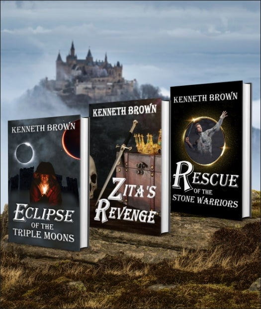
I made three different versions, because I learn and practice and sometimes think a different version would be better.
Here's an image that shows the castle in the background slightly blurred, which I'm told keeps the viewer's eyes on the important stuff in front.

And this final image showing the same books, which shows the castle in the background in clear detail.
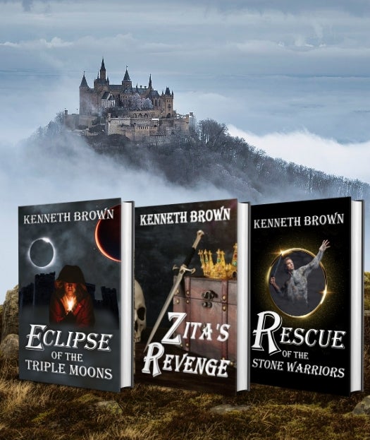
Which do you like best? Click on this link to tell me which you like best. The link takes you to a Google Form.